Designers
Carlo Baruffini, Elettra Bertazzoni, William Costello, Antonio Curci, Simone D’Alena, Andrea Desiato, Andres Gonzales, Mattia Graziani, Gianna Lardaro, Chiara Passaro, Anna Pondo, Giorgio Romano, Alessandro Tagliani.
Year
2026
Category
Product
Country
Italy
Design Studio / Department
Amplifon X Design Team, Design Group Italia (Alkemy)
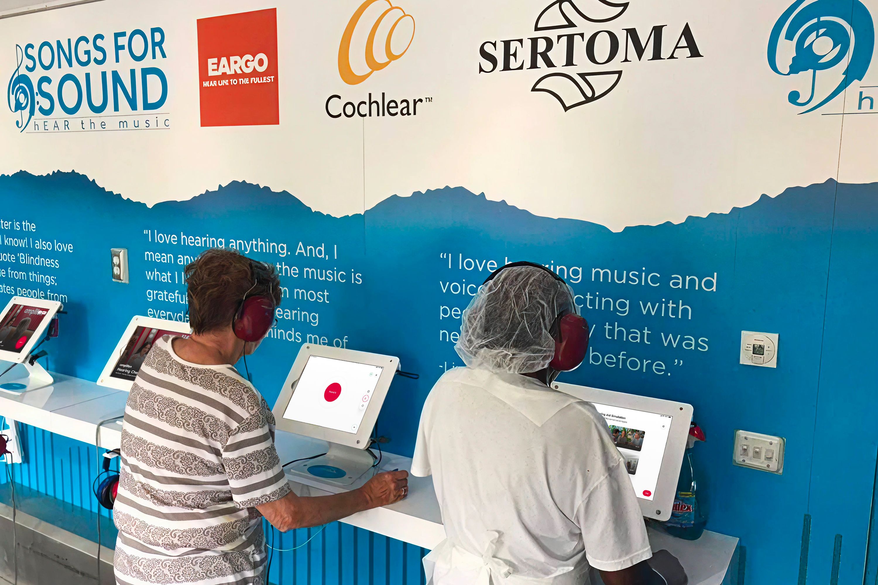
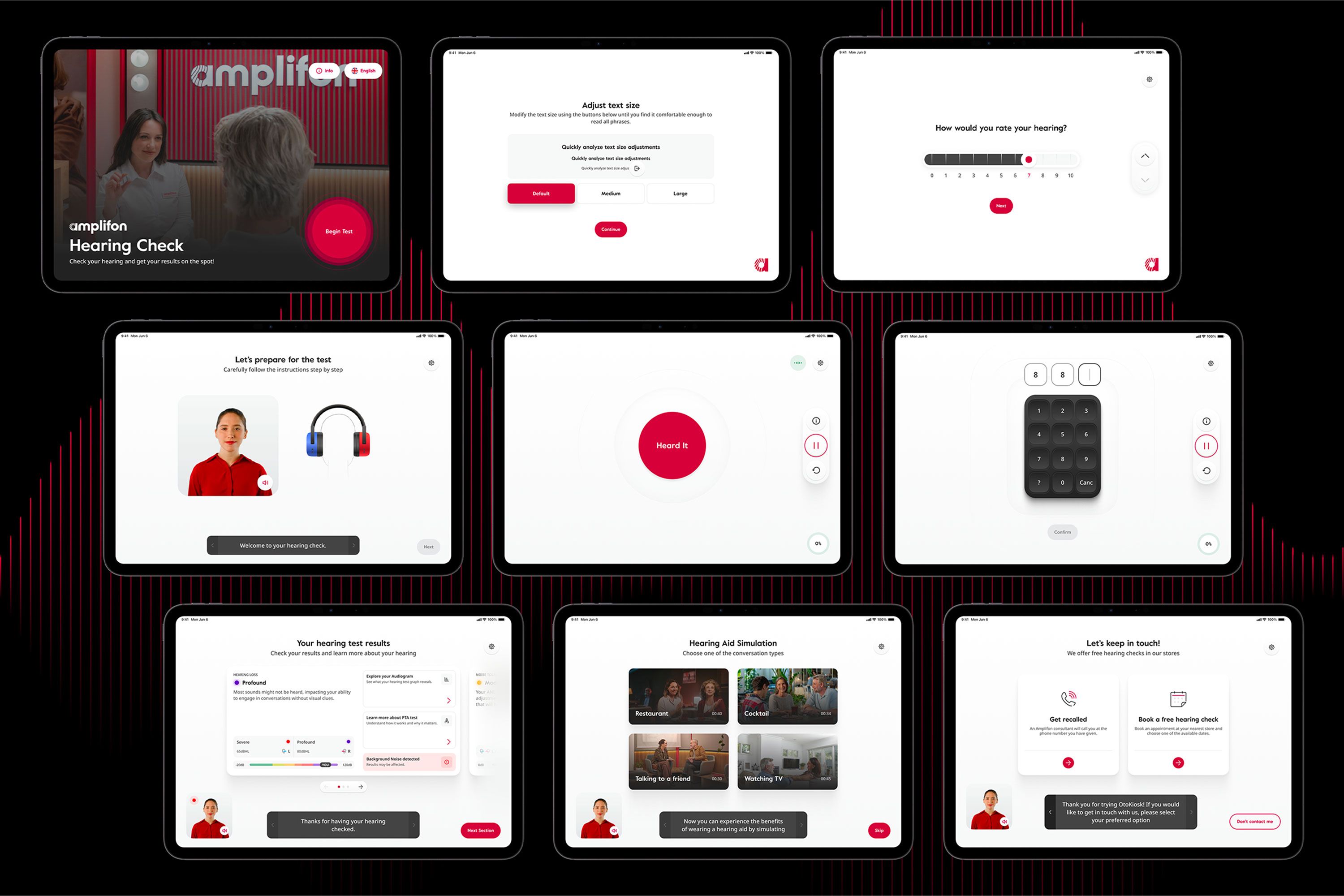
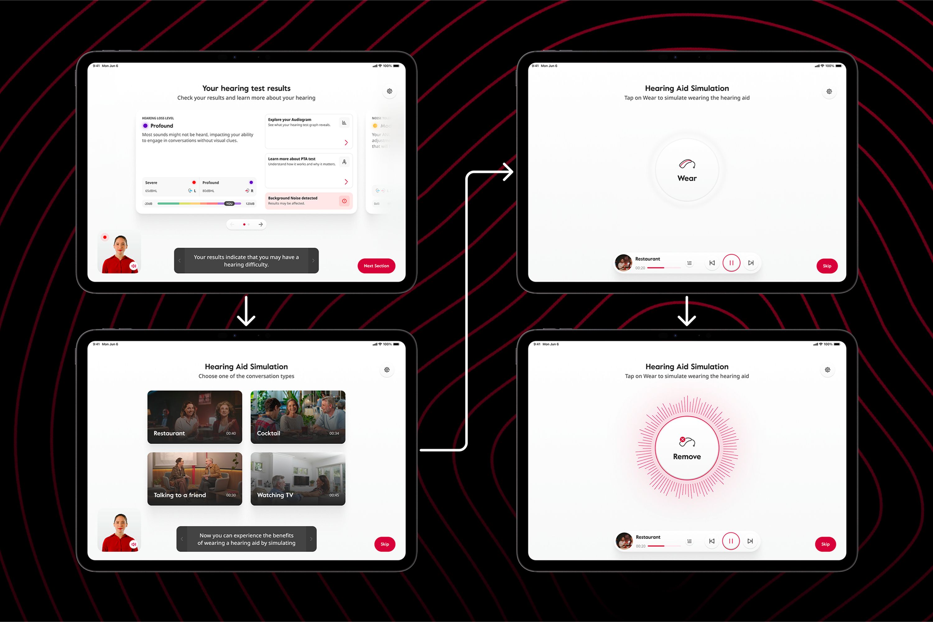
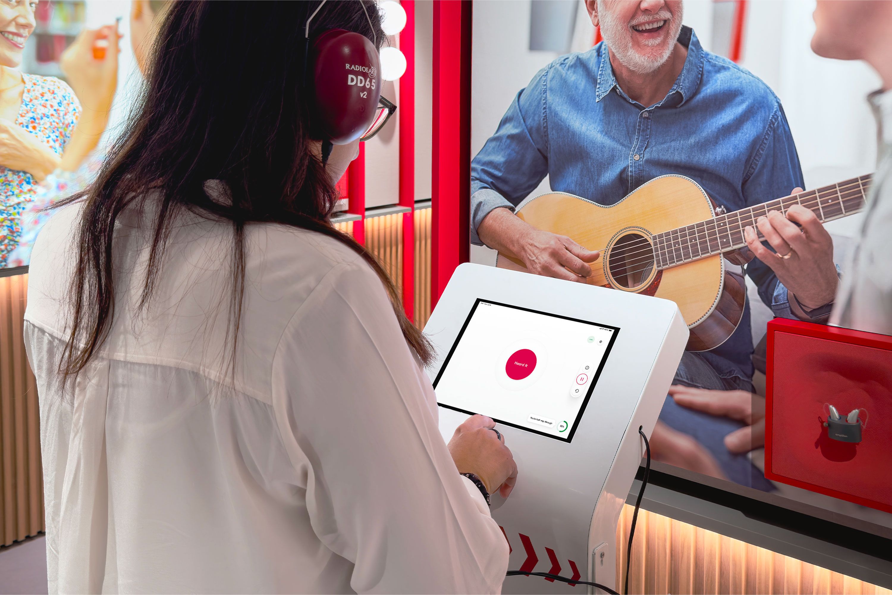
»OtoKiosk is a highly relevant solution that addresses the widespread issue of untreated hearing loss. It overcomes barriers of access, stigma, and literacy by providing a self-administered, certified screening experience. The jury was convinced by the combination of strong user research, clear KPIs, and measurable year-over-year adoption paired with an avatar-guided interface that enables nearly anyone to independently complete the test. The work demonstrates particular strengths in accessibility and clarity. It offers features such as large print, audio support, intuitive visual language, simplified flows, and personalized hearing aid simulation. By providing medical-grade screenings outside of clinics, OtoKiosk clearly demonstrates social value, scalability, and meaningful impact, especially in underserved communities.«
UX Design Awards Jury 2026 Spring
And the award goes to...
Three questions to the project team
What was the particular challenge of the project from a UX point of view?
The core UX challenge was designing a fully autonomous hearing-test experience for users with very diverse levels of digital literacy. We needed to ensure medical-grade accuracy while keeping the flow intuitive, stress-free, and extremely clear. OtoKiosk had to work in noisy retail environments, during events and across a wide range of situations. We needed to design a solution able to guide people step-by-step without staff assistance, while also managing accessibility needs. Balancing simplicity, reliability, and clinical rigor was the heart of the UX challenge.
What was your personal highlight in the development process? Was there an aha!-moment, was there a low point?
Our personal highlight was when we tested the prototype with real users who had never used a kiosk before, and they completed the test without asking for help. That was the “wow!” moment where we realized the interaction model truly worked. The low point came earlier, when we struggled to simplify the instructions without losing accuracy. Seeing the final flow come together after many iterations was incredibly rewarding.
Where do you see yourself and the project in the next five years?
In five years, we see OtoKiosk becoming a standard entry point for hearing-care screening worldwide, integrated into pharmacies, clinics, and retail spaces. From a UX perspective, the experience will evolve to be even more adaptive through AI-driven personalization. We see this project as a foundation, continuing to explore how technology can make healthcare more accessible, intuitive, and inclusive.